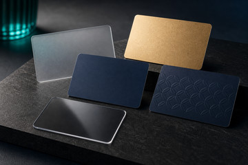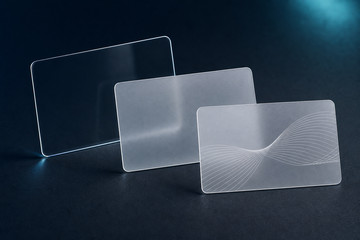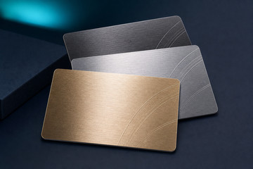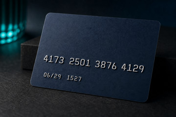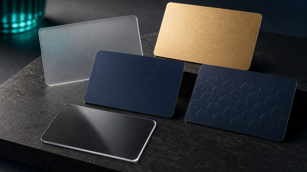
Start with the impression and the card’s real use.
Decide whether the card should feel understated, bright, transparent, metallic or tactile, then consider how often it will be carried, presented, swiped, tapped, inserted or handled by staff.
A finish name is not the starting point. The customer experience, brand style and practical handling should narrow the direction before detailed production options are compared.
Check how the artwork will behave on the chosen finish.
Fine text, reverse type, photographs, barcodes and QR codes need reliable contrast at finished size. Clear, frosted and metallic-effect cards can change how white areas, colour and reflections appear.
Embossing and other specialist treatments also need space in the layout. Plan them alongside names, numbers, magnetic stripes, chips, signature areas, holes and slots before the final proof.
Balance appearance with handling, personalisation and presentation.
Consider fingerprints, lighting, wallets, holders, readers and the way the card will be handed over. The best-looking option still needs to remain readable and practical throughout its intended use.
Use this guide to define the desired result, then continue to Card Finishes or the relevant specialist page for current options, artwork requirements and quotation.